Short answer: On 6 September 2026 we audited fourteen real US law firm websites — nine consumer firms and five of the largest commercial firms in the country — measuring the same twenty things on every one. Six of the fourteen homepages had no click-to-call link at all on mobile. Three had no H1 heading. Three of the five biggest firms had a title tag that said, in effect, “Home.” The gap between the best and worst homepage weight was seventeen times. None of it was about how the sites looked.
Almost every article about law firm website examples is a screenshot gallery. Someone picks ten sites that look expensive, writes a paragraph under each about “clean design” and “bold typography,” and calls it analysis. You cannot do anything with that. Looking at a finished site tells you nothing about the decisions behind it, and the decisions are the only transferable part.
So this is a teardown instead. We took fourteen live law firm websites, ran the same measurements across all of them, and wrote down every number. Then we looked at what the numbers actually say about which sites are built to win clients and which are built to look impressive to the partners who signed off on them. Every figure below is checkable — you can reproduce any of it in about five minutes with your browser’s View Source and developer tools.
How we ran this audit
Fourteen firms, chosen to cover both halves of the market: national consumer practices, regional and boutique consumer firms, and five large commercial firms as a control group. Each homepage was fetched twice on 6 September 2026.
- As raw HTML, with a plain HTTP request and no JavaScript — which is how a crawler first sees a page. This produced the title tag, meta description, heading structure, schema markup, script and stylesheet counts, and page weight.
- As a rendered page, in a headless Chrome browser at 375×812 — an ordinary phone screen. This produced the click-to-call count, what actually appears in the first screenful, form fields visible without scrolling, and the word count a real visitor sees.
We also pulled every site’s robots.txt and full XML sitemap, and classified each site’s URLs by their first path segment — a crude but revealing way to ask what a website is about.
Three caveats, stated plainly. Page weight is a floor, not a total — we measured the homepage HTML plus the stylesheets, scripts and images referenced directly in it, not the full network waterfall, so real transfer sizes are higher than the figures below. One site, WilmerHale, returned a Cloudflare block page to our plain HTTP client, so its HTML-level numbers are excluded; only its rendered-browser figures appear. And sites change — every number here is a snapshot of one day. If a firm reads this and fixes something, the finding was worth publishing.
One more thing worth saying up front: where a large commercial firm scores badly on a consumer metric, that is usually a rational choice, not incompetence. Cravath does not need a click-to-call button; nobody hires Cravath from a phone at 11pm. The reason those five firms are in this study is that small firms copy them — and inherit decisions that only make sense on a billion-dollar balance sheet.
The scoreboard
Every firm, every core number. “Tel” is click-to-call links in the rendered mobile page; “1st screen” is how many of them appear without scrolling. “Weight” is the measured floor described above. “Sitemap” is total URLs in the site’s XML sitemap.
| Firm | Type | Tel | 1st screen | H1s | Title len | Weight | Sitemap | llms.txt |
|---|---|---|---|---|---|---|---|---|
| Morgan & Morgan | National consumer PI | 0 | 0 | 1 (empty) | 68 | 0.79 MB | 11,207 | No |
| Shouse Law Group | Criminal defense | 10 | 1 | 1 | 65 | 0.54 MB | 6,576 | Yes |
| Miller & Zois | Mid-size PI | 1 | 1 | 1 | 111 | 0.27 MB | 723 | No |
| Sokolove Law | Mass tort | 10 | 1 | 1 | 49 | 1.98 MB | 1,549 | No |
| Stange Law Firm | Family law | 1 | 1 | 0 | 58 | 1.61 MB | 1,546 | Yes |
| Law Tigers | Motorcycle PI | 1 | 1 | 1 | 50 | 0.65 MB | 2,113 | Yes |
| Grossman Attorneys | Boutique maritime | 7 | 0 | 1 | 101 | 0.66 MB | 1,578 | Yes |
| JacksonWhite Law | Multi-practice regional | 5 | 2 | 1 | 56 | 1.19 MB | 1,632 | Yes |
| Farah & Farah | Regional PI | 35 | 1 | 1 | 59 | 2.13 MB | 1,031 | No |
| Gibson Dunn | Large commercial | 0 | 0 | 3 | 22 | 0.39 MB | 7,420 | No |
| Cravath | Large commercial | 0 | 0 | 0 | 38 | 4.65 MB | 6,467 | No |
| WilmerHale | Large commercial | 0 | 0 | 2 (1 empty) | 21 | n/a | n/a | No |
| Davis Wright Tremaine | Large commercial | 0 | 0 | 1 | 21 | 4.30 MB | 9,073 | No |
| King & Spalding | Large commercial | 0 | 0 | 0 | 22 | 4.04 MB | 6,679 | No |
Finding 1: six of fourteen homepages cannot be called
A tel: link is the single cheapest conversion feature on a law firm website. One attribute turns a phone number into a tap. On a phone, where most legal searches happen, it is the difference between a call and a copy-paste that never happens.
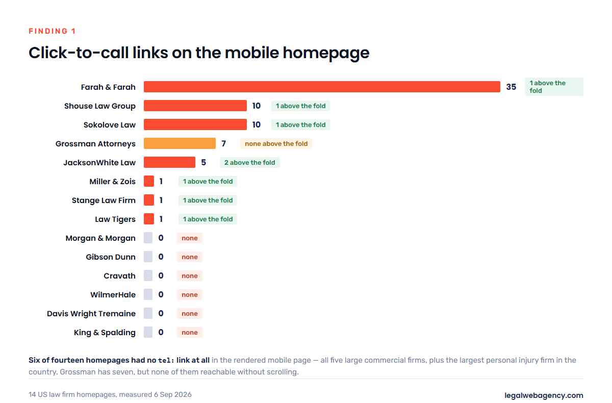
Six of the fourteen homepages had none. All five large commercial firms — expected, and rational for them. The sixth was Morgan & Morgan, the largest personal injury firm in the United States, whose rendered mobile homepage contained zero click-to-call links and two visible form fields. Their entire homepage funnel is the form.
At the other end, Farah & Farah’s homepage carried 35 click-to-call links — a separate local number for what appears to be every office and every practice page linked from the homepage. Shouse and Sokolove had ten each.
The more useful number is the second column: how many of those links a visitor can reach without scrolling. Eight of the fourteen had at least one phone number in the first screenful. Grossman Attorneys is the instructive miss — seven click-to-call links on the page, none of them above the fold, because the first screen is taken up by a hero video and a headline. The phone number is there. You just have to want it enough to scroll.
What to copy: one tappable phone number in the mobile header, visible before any scroll, on every page. Not a graphic. Not a “Contact” link. A tel: anchor.
Finding 2: three sites have no H1 at all
The H1 is the page’s one-line answer to “what is this?” — for a search engine, for a screen reader, and increasingly for an AI system summarising the page. It is not a design element. It is a label.
In the rendered pages, Stange Law Firm, Cravath and King & Spalding had no H1 element whatsoever. Morgan & Morgan had one that rendered empty — the element exists, the text does not. WilmerHale had two, one of them empty. Gibson Dunn had three, and all three were press-release headlines about lateral partner hires, so the firm’s homepage announces itself to Google as being about the arrival of a restructuring partner in London.
That is five of fourteen sites — more than a third — without a single clear heading saying what the firm does. Of the nine that had a usable one, the strongest were the ones naming the client’s situation and the place: “Maryland Personal Injury Lawyers,” “Personal Injury Lawyers in Florida & Georgia,” “Maritime, Defense Base Act & Serious Injury Attorneys.” The weakest named the firm: “Shouse Law Group,” “The dedicated team at JacksonWhite is here to help you.”
What to copy: exactly one H1 per page, containing the practice and the jurisdiction, written the way a client would say it. Your firm name is in the logo and the title tag already.
Finding 3: the largest firms title their homepage “Home”
The title tag is the blue line in search results and the text on the browser tab. Here are the five large commercial firms’ homepage titles, verbatim:
- “Homepage – Gibson Dunn” (22 characters)
- “Home | King & Spalding” (22)
- “Davis Wright Tremaine” (21)
- “Welcome to WilmerHale” (21)
- “Homepage | Cravath, Swaine & Moore LLP” (38)
Not one names a practice area, a city, or a client problem. Google gives you roughly 60 characters; these firms use a third of that, and spend it on the word “Homepage.”
The consumer firms mostly get this right — and two overcorrect. Miller & Zois runs 111 characters and Grossman Attorneys 101, both long enough that Google will truncate them mid-phrase and choose its own ending. The best-formed titles in the study sat between 49 and 68 characters and named the practice plus the geography: “Florida & Georgia Personal Injury Attorneys | Farah & Farah,” “JacksonWhite Attorneys at Law in Mesa & Phoenix, Arizona.”
This is a ten-minute fix that nobody makes because nobody looks at their own tab. If you want the rest of the technical list, our law firm SEO audit checklist walks the same ground page by page.
Finding 4: what your sitemap says your firm is about
This is the finding that surprised us most, and it is the one worth the most money.
We pulled every URL from every site’s XML sitemap and grouped them by their first path segment. That answers a question no screenshot can: across thousands of pages, what is this website mostly about?
| Firm | URLs | What the bulk of the site is |
|---|---|---|
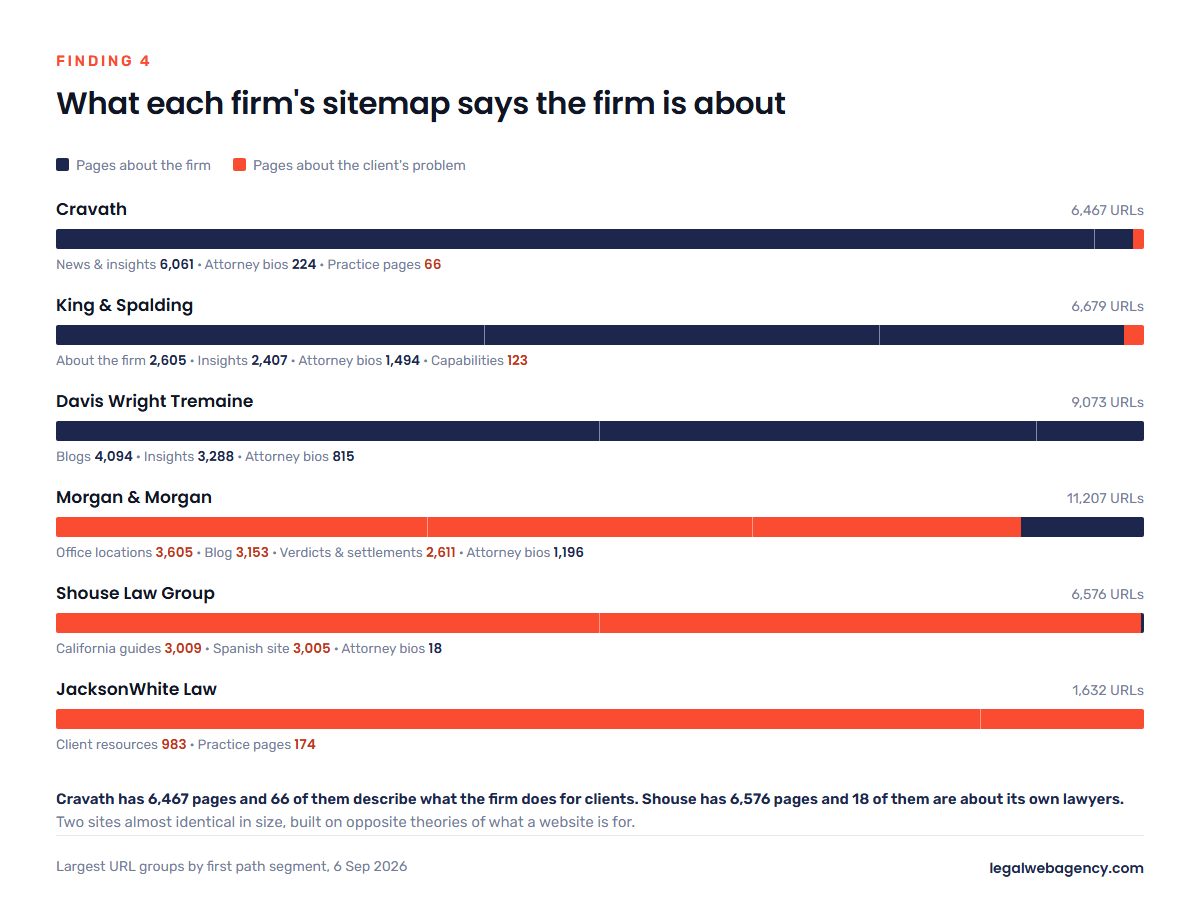
| Cravath | 6,467 | 6,061 under /news-insights/ — 94% of the entire site. 224 attorney bios. 66 practice pages. |
| Davis Wright Tremaine | 9,073 | 4,094 /blogs/ + 3,288 /insights/ — 81% thought leadership. 815 bios. |
| King & Spalding | 6,679 | 2,605 /about/, 2,407 /insights/, 1,494 /people/, 123 /capabilities/. |
| Gibson Dunn | 7,420 | 2,261 attorney bios under /lawyer/ — the single largest content type on the site. |
| Morgan & Morgan | 11,207 | 3,605 office locations, 3,153 blog posts, 2,611 verdicts and settlements, 1,196 bios. |
| Shouse Law Group | 6,576 | 3,009 under /ca/, 3,005 under /es/, 149 under /torts/. 18 attorney bios. |
| JacksonWhite Law | 1,632 | 983 under /resources/ — 60% of the site is client-question content. |
| Stange Law Firm | 1,546 | 310 articles, 278 family law matters, 212 divorce/separation, 85 child custody. |
Read the two extremes together. Cravath has 6,467 pages and 66 of them describe what the firm does for clients. Shouse has 6,576 pages and 18 of them are about the firm’s own lawyers. Two sites, nearly identical in size, built on opposite theories of what a website is for.
King & Spalding is the sharpest single number in the study: 2,605 URLs under /about/ and 123 under /capabilities/. Twenty-one pages about itself for every page about the work.
Again — for those firms this is defensible. Their clients are general counsel who already know the firm and are checking credentials. Nobody arrives at Cravath by typing a question into Google at midnight.
Your clients do exactly that. And the structural mistake we see most often in small firm websites is that they are shaped like Cravath’s — About, Our Team, News, Contact, and one thin Practice Areas page — on a budget that cannot buy the reputation that makes that shape work. A firm with forty pages should not be spending fifteen of them on itself. The correct shape is the one Stange uses: a directory of the client’s problems, with the firm’s credibility attached to each one. We cover how to build that out in the law firm website content guide.
Finding 5: a seventeen-fold spread in page weight
Measured on the same basis, the lightest homepage in the study was Miller & Zois at 0.27 MB. The heaviest was Cravath at 4.65 MB, with Davis Wright Tremaine at 4.30 MB and King & Spalding at 4.04 MB close behind. The three heaviest sites were all large commercial firms; the lightest three were consumer firms that live and die on organic search.
Some specifics from underneath those totals:
- Farah & Farah’s homepage HTML alone is 1,656 KB — 1.6 MB of markup before a single image or script loads. Miller & Zois does its whole homepage in 103 KB of HTML.
- Stange Law Firm loads 42 separate stylesheets and 37 script files. That is the signature of a page builder plus a decade of accumulated plugins, and it is the most fixable performance problem in the study.
- Gibson Dunn has five render-blocking scripts in the
<head>, JacksonWhite four. Every one of those delays the first pixel a visitor sees. - Grossman loads 44 images and lazy-loads none of them. Shouse loads 20 and lazy-loads none. Morgan & Morgan, by contrast, lazy-loads 81 of its 87 — the best result in the study.
- King & Spalding serves 18 of its 22 images without width or height attributes, and Davis Wright Tremaine all nine of its. That is a layout-shift problem: the page jumps as images arrive.
None of this is visible in a screenshot. All of it is visible in View Source.
Finding 6: four sites hide behind their own cookie banner
On a 375-pixel phone screen, the first screenful is the whole pitch. On four of the fourteen sites — Miller & Zois, JacksonWhite, Gibson Dunn and Cravath — a cookie or privacy consent panel occupied part of that first screen.
On Cravath’s mobile homepage the first three readable elements are “Privacy Notice,” “ALLOW COOKIES” and “DECLINE COOKIES.” On Miller & Zois, an otherwise excellent mobile header — phone number, “TAP TO CALL,” “TAP TO TEXT,” all present before scrolling — competes with a cookie panel offering “Accept All,” “Necessary Cookies Only” and “Manage Cookies.”
Consent notices are often a legal requirement and we are not suggesting anyone remove one. But a full-width modal is not the only compliant shape. A slim bottom bar that does not cover the headline, the phone number or the primary button costs nothing and preserves the only screen most visitors will ever look at.
Finding 7: five firms are already writing for AI, and none of them are the big ones
An llms.txt file is a plain-text summary of a site placed at its root, intended to help large language models understand what the site covers. It is new, it is not a standard anyone is required to follow, and it is not yet clear how much it is worth.
Five of the fourteen firms have one: Shouse, Stange, Law Tigers, Grossman and JacksonWhite. All five are consumer firms. None of the five large commercial firms has one. Two of the five appear to be generated automatically by an SEO plugin; Law Tigers and Grossman have clearly hand-written theirs, with a positioning statement and a curated list of primary pages. Shouse goes further and explicitly permits the file in robots.txt alongside a longer llms-full.txt — a deliberate decision by somebody, not a plugin default.
The related check: not one of the fourteen firms blocks AI crawlers. We tested for GPTBot, ClaudeBot, PerplexityBot, CCBot, Google-Extended, Applebot-Extended and six others in every site’s robots.txt. Zero blocks across fourteen firms. Whatever the profession is arguing about in the abstract, in practice the entire sample has left the door open.
One firm has an accidental version of the opposite problem. WilmerHale’s site sits behind bot protection that returned a block page to our plain HTTP request — including for robots.txt itself — while rendering perfectly in a full browser. We cannot say from outside which automated clients that rule catches. But a page that will not serve itself to a simple request is a page some crawlers will never read, and that is worth knowing about your own site before it costs you something.
Finding 8: schema markup is where the small firms beat the big ones
Structured data is how a page tells a machine what it is looking at: this is a law firm, this is its address, this is a review, these are its practice areas.
King & Spalding and Davis Wright Tremaine had no JSON-LD structured data on their homepage at all. Cravath had three types. Meanwhile Sokolove had 21 distinct schema types, Grossman 20, Farah & Farah 18, Morgan & Morgan 12 — including the reviews, ratings, service catalogues and postal addresses that produce enhanced search results.
There is one counter-example worth flagging, because it shows the difference between publishing volume and being legible. Shouse Law Group has 6,576 pages and one of the strongest content operations in the profession — and its homepage carries only four schema types, none of which identify it as a legal service or an organisation. The most prolific publisher in the study has the thinnest identity markup on its front door.
Finding 9: the Spanish-language gap
Of Shouse Law Group’s 6,576 URLs, 3,005 sit under /es/ — a Spanish-language site almost exactly as large as the English one. Grossman Attorneys goes further still: 263 pages each under /es/, /es_es/, /fr/, /ru/ and /uk/, which is 83% of its entire sitemap, matched to the maritime and Defense Base Act workforces it represents.
After those two it falls away fast. Farah & Farah runs 58 Spanish pages. Morgan & Morgan — 11,207 URLs, the largest site in the study — has ten. Cravath and Gibson Dunn have no language-prefixed section in their sitemaps at all.
For a consumer practice in a market with a significant Spanish-speaking population, this is the least contested search opportunity we found. Not a translation plugin bolted onto an English site, which produces duplicate thin pages and no trust: genuinely written pages for the practice areas that matter most, with a Spanish-speaking person answering the phone number on them. Grossman’s approach — four languages chosen to match a specific client population rather than to look international — is the model.
Six sites, torn down individually
Shouse Law Group — the content machine
Right: 6,576 pages built around what people ask, not who the firm is — 18 attorney bios in a site that size is a statement of priorities. Eight form fields and a phone number visible in the first mobile screen. Zero render-blocking scripts in the head, the cleanest result in the study. A hand-maintained llms.txt and llms-full.txt. Half the site in Spanish.
Leaks: the H1 is “SHOUSE LAW GROUP” — the firm name where the practice and jurisdiction should be. Homepage schema is four generic types with no LegalService or Organization. Twenty images, none lazy-loaded.
Steal this: the ratio. Ask what fraction of your pages exist to answer a client’s question rather than to describe your firm. If it is under half, you have found your next quarter of work.
Morgan & Morgan — the biggest, and unreachable by phone
Right: 11,207 URLs, almost all client-facing — 3,605 location pages, 3,153 blog posts, 2,611 verdicts and settlements. Twelve schema types. 81 of 87 images lazy-loaded, the best image handling we measured. A homepage that leads with “The Fee Is Free™. Only pay if we win” — the client’s biggest objection, answered before anything else.
Leaks: zero click-to-call links on the rendered mobile homepage. An H1 element that renders empty. Only two form fields visible before scrolling, and 612 words on the page — the second-lowest of any consumer firm here.
Steal this: the verdicts-and-settlements architecture. 2,611 individual result pages is a trust asset no competitor can copy quickly, and each one is a page that can rank. Then do the thing they did not: put a phone number in the header.
Miller & Zois — the fastest site in the study
Right: 0.27 MB total and 103 KB of HTML, roughly a sixth of the next-lightest consumer site. “TAP TO CALL” and “TAP TO TEXT” both in the first mobile screen, in plain words. A flat URL structure — 723 pages sitting at the root, no folders — which is deeply unfashionable and works fine.
Leaks: a 111-character title tag Google will truncate. A cookie panel competing with that excellent mobile header. And at 723 URLs it is the smallest site here by a wide margin — a ceiling on how many client questions it can answer.
Steal this: “TAP TO CALL / TAP TO TEXT” as literal button text. Not a phone icon. Words that say what happens when you touch them.
JacksonWhite Law — the best-balanced consumer site here
Right: 983 of 1,632 URLs under /resources/. Two click-to-call links and five form fields in the first mobile screen, with “Talk to someone now” next to the number — the clearest first screen in the study for a multi-practice firm. An llms.txt file.
Leaks: four render-blocking scripts in the head. A cookie banner in the fold. And an H1 that reads “The dedicated team at JacksonWhite is here to help you” — warm, and about the firm, on a homepage that is otherwise entirely about the client.
Steal this: a single /resources/ hub that holds the majority of your pages, so every question you answer compounds into one recognisable section rather than scattering across the site.
Stange Law Firm — right structure, neglected front end
Right: 1,546 URLs organised by the client’s problem — /family-law-matters/, /divorce-separation/, /childcustody/. A headline that speaks to a person in trouble: “Here To Help You Rebuild Your Life.” An llms.txt file, and the only live chat widget we could detect in any of the fourteen pages’ initial HTML.
Leaks: no H1 anywhere on the homepage. Forty-two stylesheets and 37 script files. And zero form fields on the entire homepage — the only site of the fourteen with no form at all. The whole homepage funnel is one phone number and a chat widget.
Steal this: the URL structure. Then notice what it is costing them: the best content architecture here is attached to the weakest conversion surface. Structure without a form is a library, not a practice.
Cravath — the site every small firm should stop imitating
Right, for them: a restrained, confident homepage that leads with matters — a $110 billion acquisition, a Ninth Circuit win. For an audience of general counsel who already know the name, that is exactly the correct pitch.
The measurements: 4.65 MB, the heaviest page here. No H1. A title tag reading “Homepage | Cravath, Swaine & Moore LLP.” No click-to-call. Three schema types. And 6,061 of 6,467 URLs under /news-insights/, against 66 pages describing practices.
The lesson: every one of those is survivable on a reputation built over two centuries and a client list that arrives by referral. None of them is survivable on yours. When a small firm’s website apes this — heavy hero, restrained copy, no phone number, a News section instead of answers — it inherits the costs of the model without the asset that pays for them.
Run this audit on your own site in twenty minutes
Every measurement in this article is one you can take yourself. Open your homepage on a phone, then open it on a desktop with View Source and your browser’s developer tools, and answer these twelve questions honestly.
- Is there a tappable phone number in the first screen on a phone? Not an icon, not a “Contact” link. Search the page source for
tel:. Six of fourteen firms here failed this. - Do you have exactly one
H1, and does it name your practice and your area? Search the source for<h1. Five of fourteen failed. - Read your title tag out loud. Does it say what you do and where, in 50–60 characters? Does it say “Home”?
- Count your pages by type. Pull your XML sitemap (usually
/sitemap.xml). What fraction of URLs are about the client’s problem versus about your firm? Under half is a problem. - How many stylesheets and scripts load? Developer tools, Network tab, filter by CSS and JS. Over about fifteen of each is a plugin audit waiting to happen.
- Are your images lazy-loaded and given width and height? Search the source for
loading="lazy". If it appears zero times and you have thirty images, that is your fastest performance win. - Does your cookie banner cover the headline on a phone? Load it on an actual phone, not a resized desktop window.
- Do you have structured data? Search the source for
application/ld+json. If it is absent, machines are guessing at what you are. - How many form fields does a visitor see before scrolling? Zero and thirty are both wrong. Two to five is the working range.
- Does your homepage answer the client’s first fear? Cost, time, or “do I even have a case.” Morgan & Morgan answers it in the first line.
- Does your site serve itself to a plain request? Try loading
yoursite.com/robots.txtin a private window. If bot protection is blocking simple clients, some crawlers never read you. - If you serve a non-English-speaking client population, do you have pages for them? Ten of the fourteen sites here have essentially none.
If you would rather have someone else run it and hand you the list, that is exactly what our free law firm SEO audit covers.
So what actually makes a law firm website “best”?
Nothing in this study correlated with how the sites looked. The lightest, fastest site here has a plain flat structure and unfashionable URLs. The most sophisticated content operation has a homepage H1 that just says the firm’s name. The most beautifully art-directed pages belong to firms whose sitemaps show they are not competing for search traffic at all.
The sites that work share four things, and all four are structural:
- They can be contacted from the first screen, on a phone, without scrolling.
- Most of their pages are about the client’s problem, not about the firm.
- They are legible to machines — one clear heading, a descriptive title, structured data, a page that loads without a fight.
- They are fast enough not to be abandoned, which mostly means fewer scripts rather than better hosting.
Every firm in this study got some of those right. Not one got all four. That is the actual opportunity: the bar in this profession is far lower than the design of the best sites suggests, and the gap is made of things you can check in an afternoon.
If you want to go deeper on any single piece of this, the essential features checklist covers the conversion surface, the conversion rate guide covers what happens after the click, and how to choose a web designer covers who should do the work.
Want your site measured the same way?
We run this exact audit — the twelve checks above, plus the sitemap composition analysis — on law firm websites every week, and we build the sites that come out the other side of it. If you would like your own numbers next to the fourteen above, talk to our legal web designers or start with the free audit.
All measurements taken 6 September 2026 from publicly available pages. Figures describe those pages as they were served on that date and may since have changed. This article is commentary on public website engineering, not on any firm’s legal services.